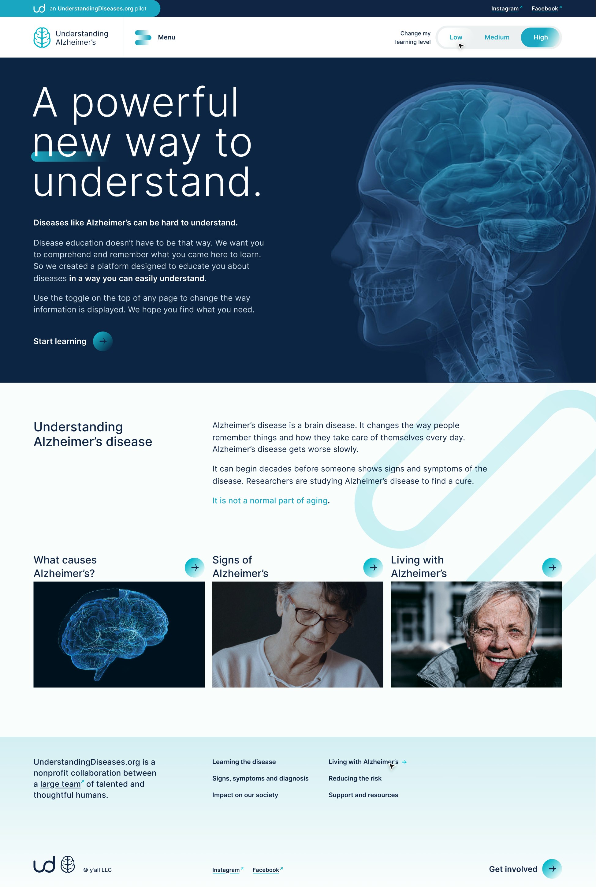
A platform for dynamic learning
Leadership, Content strategy, Public voice, UI + UX + Tech
Because understanding diseases doesn’t have to be hard.
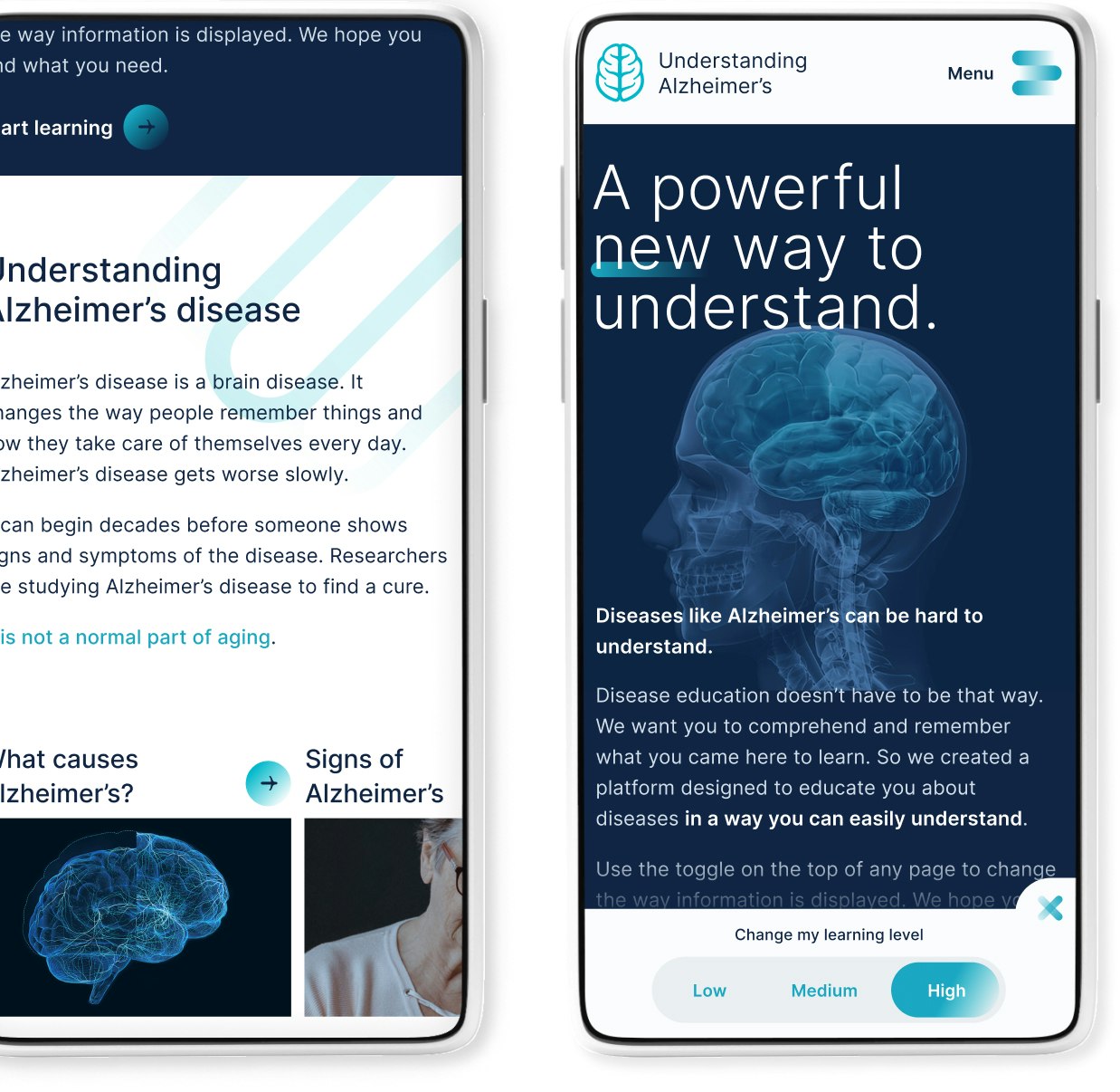
Content is not one size fits all
As part of a partnership with some amazing humans, we built a ground-breaking web-based platform that offers disease education content at multiple levels of understanding.
There were many levels to this problem
Everyone deserves access to important information that makes sense to them. But every person has a different level of understanding and reading ability.
How do you bring to life a platform delivering disease learning information that makes sense to each and every individual, at a time when they most need clear, concise answers?
The answer became very clear—we had to create a platform that adjusted to each user’s reading level. This solution clearly didn’t exist. Yet.
How we architected the solution
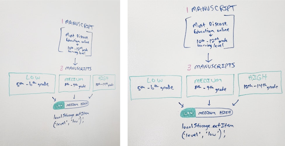
We tapped expert partners to help create content at multiple fry-tested levels of reading ability.
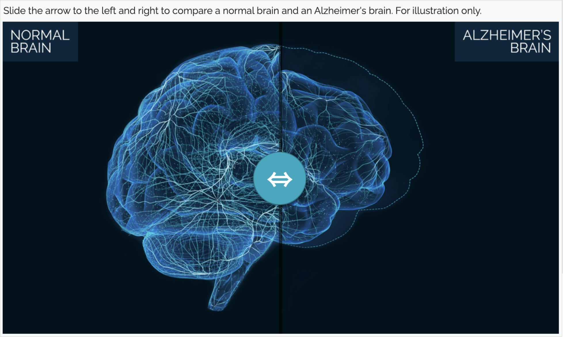
We determined some key pieces of content that would need to be brought to life interactively to really tell the story.
A “default” reading level was set, and then UI was created to give the user the ability to change the content to their liking.
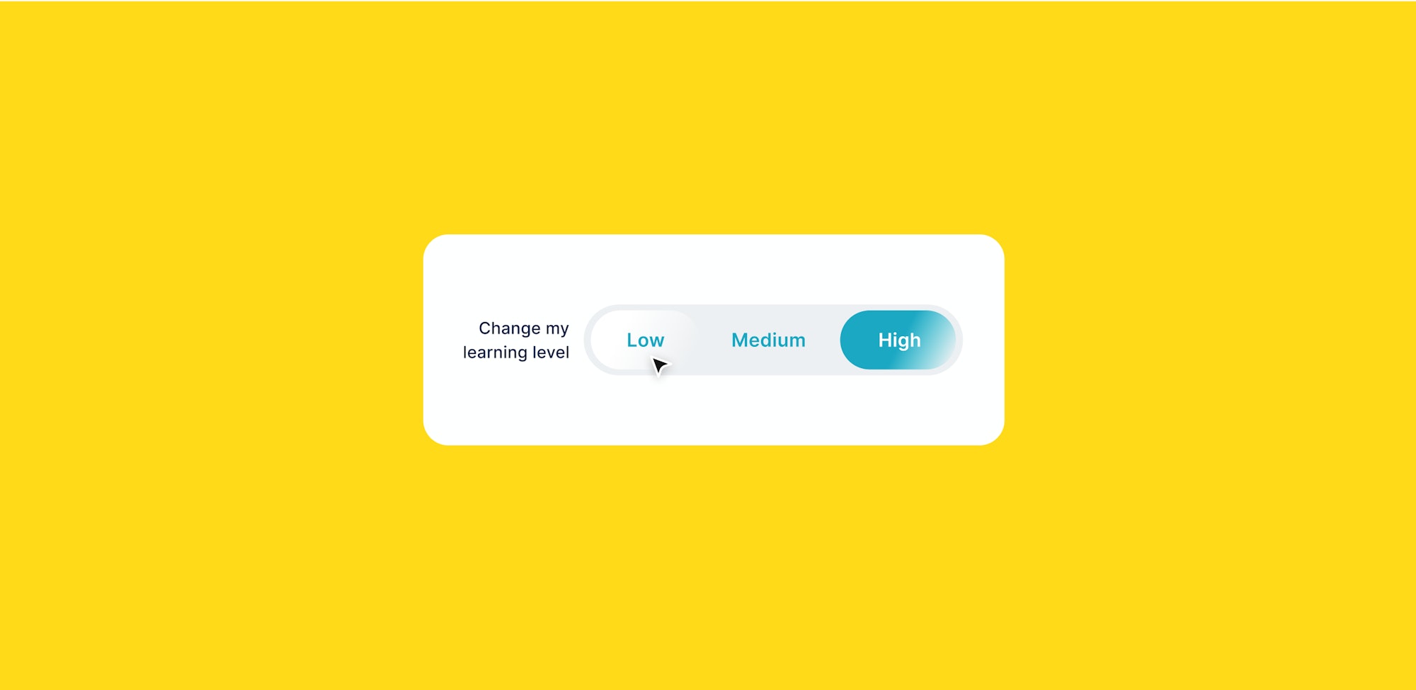
It was unbelievable—there is something genuinely special about seeing users actually use the tool the way it was intended.
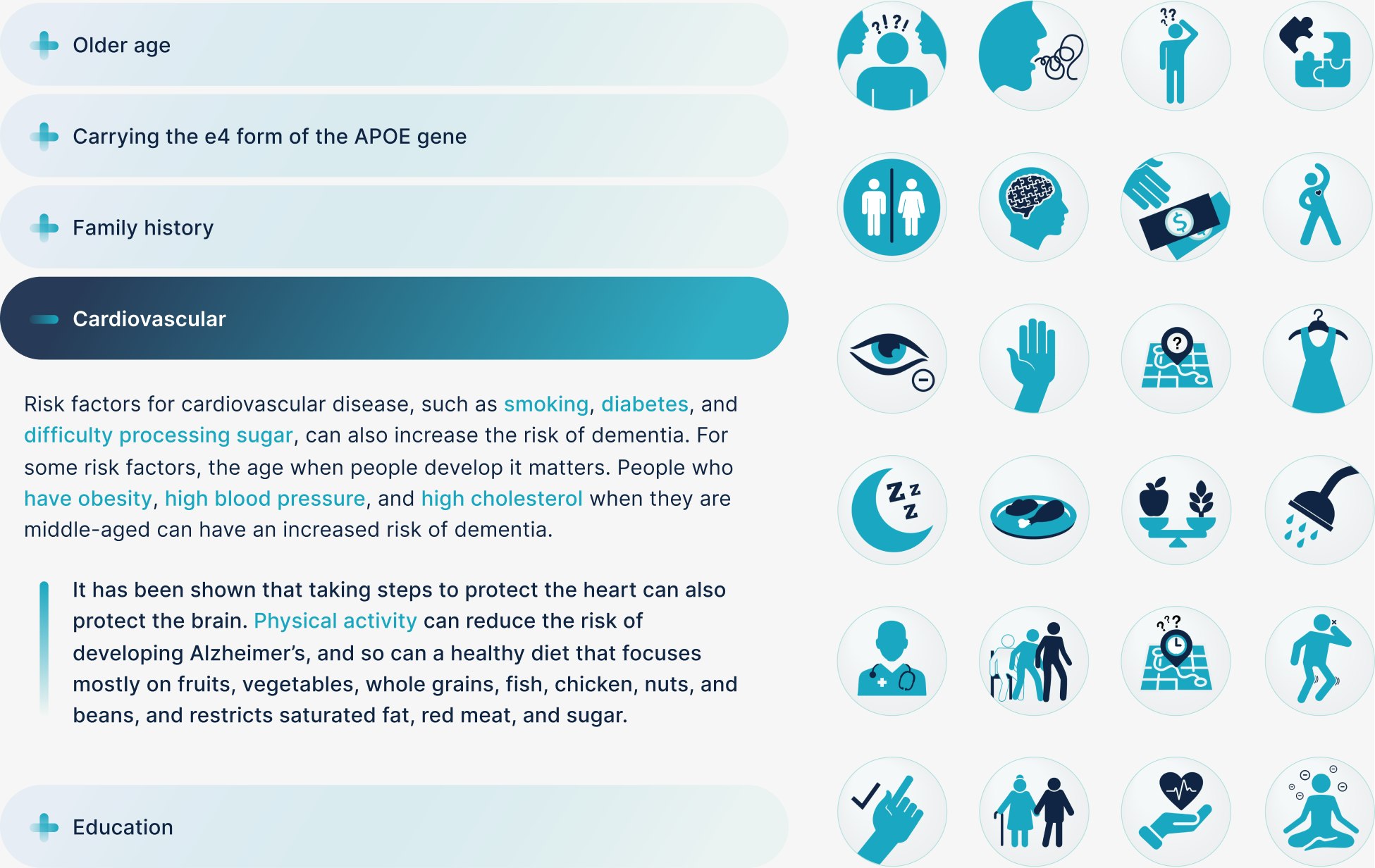

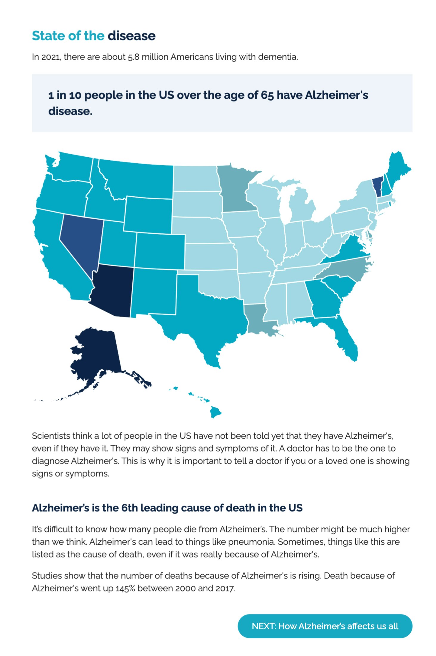
The result? Learning that's easy + for you
